Your book title page might not be the first thing you think about when you are preparing your book for publishing.
However, you should give it some thought because you are presenting the title and your name to readers.
The layout and format should be clean and clear, but there are lots of little options you can try.
It is one part of your book that you want to look professional, especially if you are self-publishing.
The elements of a title page
The page usually contains minimal information, but it should be clean, clear, and fit for the purpose.
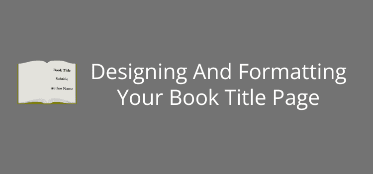
As a minimum, include your book title. Format it to be centered, in a bold font that is easy to read.
If your book has a subtitle, position it just below the title, but use a slightly smaller font or lighter style.
Your author name comes next, which is centered below the title or subtitle.
If you’re publishing with your own imprint or using a self-publishing platform, you can also add your publisher’s name or logo at the bottom of the page.
For a book with different versions, special editions, or reprints, you can add the edition information, using terms like “Second Edition” or “2025 Revised Edition.”
It isn’t a requirement for most books, but it’s useful if you republish your book with updates or changes.
Adding the publication year, often above the publisher info, is also a common addition to the page.
One important point to remember is that you do not include a page number on the title page. It’s part of the front matter, where all pages are unnumbered.
You might occasionally see a title page with an epigraph or epigram, but it’s best practice to include these on a separate page.
Page title formatting options

When it comes to formatting your title page, you have a bit more flexibility than you might think, as you can see in the image above.
By far, the most common and professional format is center alignment for all elements, which creates a balanced appearance familiar to most readers.
Use a larger font size for your main title, usually between 24 and 36 points. It also pays to check the capitalization of any prepositions in your title.
If you have a subtitle, format it in a smaller size, perhaps 16 to 20 points. You could also italicize it or use a lighter font weight to contrast it against the main title.
Your author name should be in a slightly smaller font than your title, but still large enough to stand out.
Some books use small caps for the name or publisher, which can add a refined touch.
You might be tempted to use decorative or script fonts, but while they may look artistic, they often reduce readability.
It’s safer to stay with serif fonts like Garamond or Georgia for a classic look, or clean sans-serif fonts like Helvetica or Lato for a more modern look.
Whatever font you choose, make sure it matches the tone and genre of your book.
If you want to be creative, you could look at adding a background graphic, light texture, or a thin decorative frame. But only do so if it enhances the page because elements like this can be a distraction.
However, decorative elements can work well for poetry collections, memoirs, or illustrated books.
There are no strict rules, so you can experiment with spacing, fonts, or decorations, but using a minimal approach usually works best.
One last tip is to preview your title page in both print and ebook formats to make sure you have no page layout issues before publishing.
Mistakes to avoid
It’s so easy to quickly add a title page with the book title and your author name.
However, when you’re concentrating on more important issues or parts of your book, you can make minor errors that can look unprofessional.
The most common mistake is including a page number. Title pages should never be numbered, just like all pages in your book’s front matter. It’s so easy to overlook this, especially in a print book, where pages are always numbered.
In most word processors, you can start page numbering on the first page of your story. To do so, insert a section break before that page, then format the page numbers in the new section to begin with page one.
For ebooks, there’s no problem because ebooks don’t have page numbers.
Another issue is using inconsistent fonts or styles that are radically different from your interior layout, which can make your book look disjointed.
Also, be careful that you don’t try to cram too much information onto the page.
Stay with the essentials: title, subtitle, author name, and, if appropriate, the publisher.
Readers will usually quickly flip past the title page. However, they might take a closer, critical look if something seems odd.
Summary
Your title page of your book may only be one small part of your front matter, but it plays a part in giving your book a polished and professional appearance.
You’re telling readers the title and your name, which also appear on your book cover, but with more clarity and style, and setting the tone before your story begins.
Keep the layout simple, choose readable fonts, and avoid common mistakes like page numbers or cluttered design.
Keep in mind the only elements you should use on the page:
1. Book Title
2. Subtitle
3. Author Name
4. Publisher’s Information
5. Edition Information (if applicable)
6. No page numbers
It’s easy to create a title page that looks just right.
So, take a moment to think about the elements without rushing past them.
You’ll thank yourself for it when your book looks and feels perfect, from the very first page.
Related Reading: How To Write A Disclaimer For A Self-Published Book
Share This Article


