How do you choose book cover fonts and colors for a new book cover?
Indeed, you can’t judge a book by its cover.
But equally valid is that you can’t judge a book if you can’t read the title.
If you are self-publishing and your book is struggling to gain traction and sales, one reason could be the book cover fonts you are using in your design.
Your book cover
For many self-published authors, the cost of hiring a professional designer to design a cover might be prohibitive.
Custom covers can cost anywhere from $200 to $600 or more.
There is also the choice to buy a pre-made professional cover.
The price is generally between $45 to $65.
But if book designers are beyond your budget, you can use a free cover creator to design your book cover.
Canva is one of the best options.
With a free account, you can experiment and create lots of different ebook covers.
But you should still follow the basics for good eye-catching designs.
It is especially true today because your book cover is the first thing a potential book buyer sees.
On most online book retail sites, it will almost always be in small thumbnail size. So it needs to stand out.
Critical elements for book covers
Of all the book cover ideas that can go into excellent cover design, the color of the title is by far the most important.
Your book title must be easy to read, and it is why colors and fonts for a book cover need careful selection.
Depending on whether you are reading this article on a desktop or mobile, the cover images below will differ in size from small to very small to fit your screen.
The key to this challenge for authors is to ensure that people can read your book title easily, even when it is reduced to the smallest of thumbnails.
It is why the selection of the font for a book cover design is so critical.
I took the screengrab below of the first group of bestsellers on Amazon that popped onto my screen.

Do you notice the one commonality they all have?
It’s obvious. All of the book title fonts are white.
If you do a quick scan of top-selling books on Amazon, it is rare to find a cover that does not use white titles.
I checked the romance genre as well.

Again, they are predominantly white book titles. There is no reason to go wild with a color palette.
If you want a cover that stands out, you can’t go wrong with a white headline font.
Can you use other colors?
I’m not saying you can’t use other colors for a title font.
But if you can’t afford a book designer, your book stands a better chance of being noticed if you use a white title over your cover image.
You might have spent hours finding stock images to merge for your ebook cover art.
But how much time and thought did you give to the readability of your title and author name?
Okay, so white is a safe choice.
But in fact, one of the vital design secrets is in selecting cover ideas that have high contrast.

In the samples above, you can see that red on black, black on red, and dark brown on beige all create clear contrast.
But be careful if you become adventurous. You might have a beautiful cover image, but your choice of font color can lose your title.

With this last group of sample covers, you can see why they might not grab attention on Amazon or social media.
There is no contrast between the titles and the cover images, making it almost impossible to read the titles.
The best advice is to stick with white, especially if your book has a long title.
Even if you have hired a designer, discuss how well your title will read in small thumbnail images like the ones above.
Avoid black titles
If there is one color to avoid, it is black.
Unless you use black on a stark white background and in high resolution, black can blend and look fuzzy on any color background or image.

Any dark color scheme for a book title will be difficult to read in a small image format, no matter what cover font you use.
Your book cover design is your first priority in book marketing, so make it work for you.
When you create a cover, never allow your title to blend into the background.
Book covers tell a story
Have you noticed that bestselling books in most genres generally use sans serif fonts, but others regularly use serif or fancy fonts?

Can you hazard a guess of the genre of the book covers above? Why are they all using a serif font?
For romance, women’s fiction, and chick-lit genres, serif fonts are very common, and it is almost as if the font defines the genre.
If you have cover ideas that don’t follow the expectation of readers or a particular genre, it can cause problems of instant recognition.
You want to be inventive, but don’t go too far from what readers expect.
The font for the science fiction genre is usually simple, sans serif.

But the title color plays a part as well. Gold titles are common in sci-fi, as are shadowed or in-relief titles.
Another feature of science fiction books is that titles tend to be very short.
Often only one or two words, which makes it easy to use large font sizes and dramatically increases readability.
Selecting fonts for book titles needs careful consideration.
More examples
In the examples below, you can see that self-help books almost always use a clear sans-serif typeface and often use white space to help a title stand out.
A reader of this type of book has expectations.
Look at how a personal development or self-help book cover design appeals to the reader.

While you have little control over body text fonts with ebooks, your cover fonts can really tell a story.
Quality design is always about clarity for ebooks and print books.
These few top-selling books on Amazon have that graphic design quality.

One last design feature for fonts for covers is that you should be very careful to avoid mixing fonts.
If you don’t have experience in typography and book cover design, stay well away from mixing different font styles on your cover.
Stick with one font family in either serif or sans serif.
Also, avoid using a typeface designed for decorative use, scripted fonts, and hand-drawn free fonts.
Most of these are usually very difficult-to-read book cover fonts, especially in a small thumbnail view.
However, there is some scope to use fancy fonts for children’s book covers.
Be careful when using free book cover templates

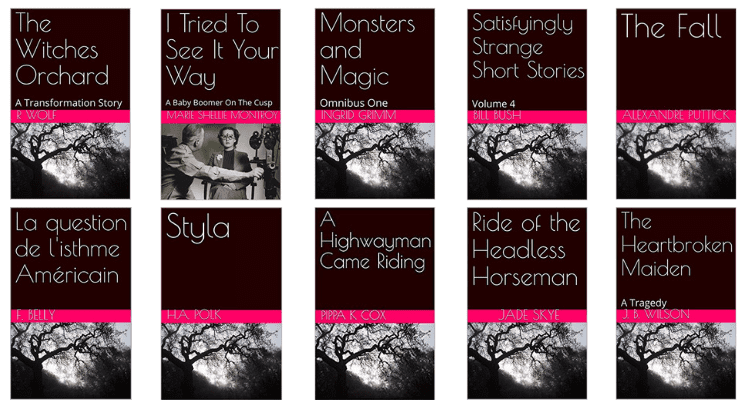
I could have easily added another one hundred covers to the image above.
But this small selection above took me less than two minutes to find and collect using Google reverse image lookup.
It is also worth noticing that only one of the books above bothered to modify the default image.
How lazy can you get when it comes to your book cover?
Free book cover makers are easy and quick to use.
But you must carefully check before using a popular book cover design template.
You are not trying to win a design contest, but you want your cover to be as unique as possible.
Do a check to see how often other authors use a free book template before you decide.
Often, it is much better to find a stock image, even if it costs a dollar or two, and then add your title and author name.
The black and white of fonts for book covers
The best book cover fonts are clear sans serif. As for font color choices, well, white, white, and white. Use black at your peril.
You don’t need to spend a fortune on professional book cover ideas and design services to get it right.
The best way to get great cover ideas is to search for the bestselling titles in your genre and copy and steal the font and color styles.
If you have a long book title, consider reducing it to less than four words and using a sub-title.
Long titles are difficult to read on a cover when reduced to thumbnail proportions, no matter what font or color you use.
Three elements can help you to sell your book.
They are a high-quality book cover, your book description, and your selection of categories and search keywords.
Get these three things right, and you will improve your chances of success.
Related reading: How To Punctuate Book Titles Or Can You Be A Little Creative?


Reblogged this.