You can publish an ebook in color using any self-publishing platform, yet many authors overlook the possibility, especially when publishing with Amazon KDP.
This hesitation is probably because Kindle reading devices display content only in black and white or grayscale. However, this narrow focus overlooks a significant opportunity. Apart from Kindles, a wide range of ebook reading devices support color.
But even if a device doesn’t support color, it will render ebooks published in color perfectly in black and white.
While authors invest in creating eye-catching ebook covers, many miss the potential of color inside the book. Why not extend that visual appeal for the entire ebook?
Why publish an ebook with some color?
Not all ebook readers use a dedicated ereading device. Many use a tablet, phone, or reading app.
Sure, a Kindle device is black and white, but the Kindle app, which many readers use, renders in full color.
For Apple users, the Books app is the same.
Authors of children’s books and comics, especially, always publish in color.
But for fiction and nonfiction authors, it’s a rare occurrence.
However, this might change soon, as there is a lot of chatter about Amazon releasing a full-color Kindle device.
But at present, the technology for colored e-ink displays is probably a little too expensive.
A few new color e-readers are already on the market, but they have been criticized for their washed-out colors.
However, technology moves rapidly, so it’s probably fair to assume that Amazon will offer a color version of the Kindle device sooner rather than later.
At that point, it will make sense for ebooks to use color to improve their visual appeal. But why wait until then?
How to add colored elements to an ebook
If you use the Kindle Create app, it offers plenty of options to format your ebook in color.
There’s also the option to insert JPEG images.
You can do the same with almost any word processor, such as Word or Apple Pages.
For fiction authors, you are not going to create a comic of your book or add hundreds of images.
But you can add enhancements such as colored chapter titles, drop caps, and decorative text dividers.
Another possibility is to include an image before each chapter.
You don’t want to go overboard.
However, a few small changes can certainly help improve your ebook.
For fantasy authors, fictional maps are another element to consider.
In nonfiction books, perhaps tables and charts or photographs.
Self-help ebooks are another that could use color to add emphasis or highlight important information.
These additional elements add value to your book for readers using a color-rendering device or app.
But even for readers using a black and white reading device, the elements will be in clear and sharp grayscale.
So they will still notice a positive difference in the formatting of your book.
Changing the look of an ebook
It doesn’t take much effort at all to make some minor changes to your ebook formatting to accommodate some color.
And it doesn’t need to be only for a new ebook. You can update an existing title very easily.
Here are a few quick examples I created to show you how you can change the look of an ebook.
First, let’s add an image to the book’s title page.
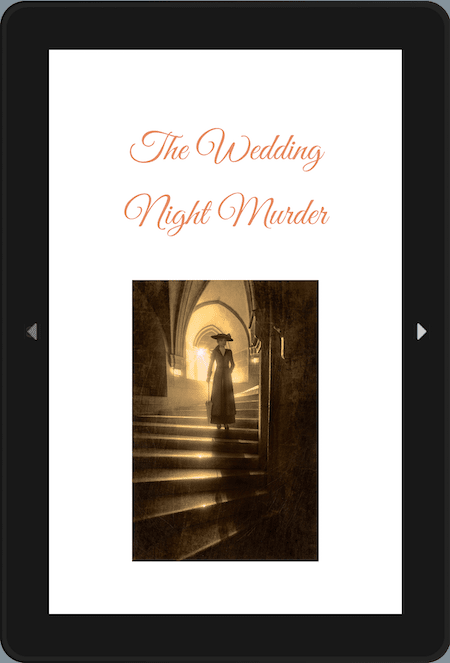
A title page is usually all text and is often skipped by readers. Simply adding an image is an easy way to improve the appeal of the page.
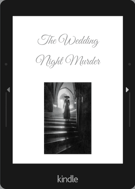
But how will it look on a black and white device?
In grayscale, the image is still sharp and clear.
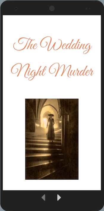
Lastly, let’s look at a phone render.
Like a tablet or app, it’s far more appealing, even on a small screen.
Quick text enhancements
Now, let’s look at a sample page of text with a few simple changes.
I made three quick modifications.
I changed the color of the chapter title and drop caps and added a text divider.
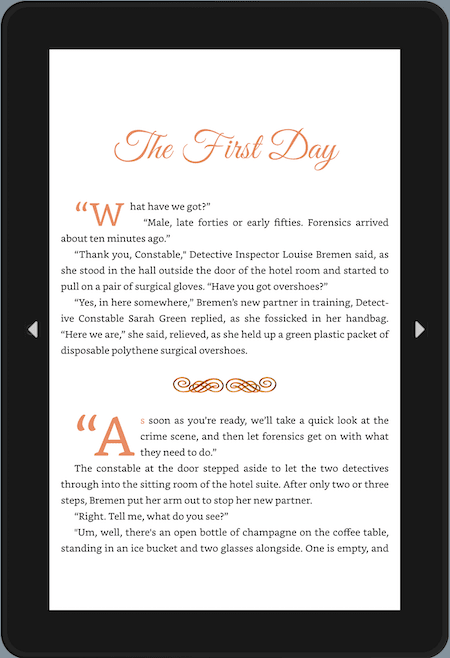
It’s a little bit crowded, but my aim was to show what is possible.
You would spread out these elements in an ebook.
Now, how does the same page look on a Kindle?
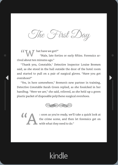
Sure, it’s not in color.
However, the grayscaling helps to show the difference in the elements, which still adds a little more reading appeal.
Now for a phone again.
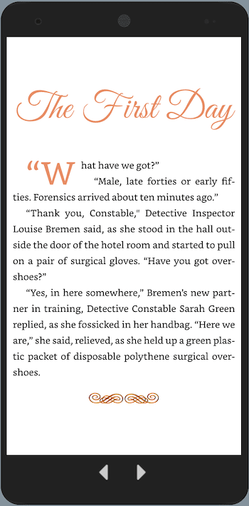
All the additional elements render perfectly and look great on a small screen.
It only took me a few minutes to create this quick experiment and make these few simple changes.
But with a little more time and imagination, I’m sure you could come up with many more ideas to improve the visual appeal of your ebooks.
The only consideration is the choice of colors for certain elements.
If you choose pastel or very light, they may appear extremely light gray on Kindle devices.
You can check this with the preview in Kindle Create to ensure your headings are readable.
Why color can improve an ebook
Here are some reasons why it makes sense to enhance your ebooks using color.
1. Color can help improve the visual appeal and make your ebook more engaging for your readers.
2. Using colors allows you to differentiate headings, subheadings, drop caps, and other text elements in an ebook.
3. You can highlight important information in a more effective and pleasing way than with bold or italics.
4. Colored elements may be effective in capturing the attention of potential readers, particularly during preview reads.
5. It’s an opportunity to use full-color images to enhance a story or to add proof.
6. It simply looks better.
Yes, the text of a book is black and white.
But for all the other elements in an ebook, there are no downsides to making changes to improve the reading experience for your readers.
Summary
The ebook has been a dull black and white reading experience for a long time.
And there’s no reason why that needs to remain the same.
So many readers are now using apps and devices that can read full color in ebooks.
On top of that, all the signs point to ereading devices changing in the near future.
There are many advantages to enhancing your ebooks with a touch of color.
But there are no real disadvantages, as long as you are careful to accommodate the reading experience for readers still using grayscale e-ink readers.
Related reading: How To Add Drop Caps To A Book Or Ebook
Share This Article


Thanks for the info. on the coloured Kindle. I’ve been using a Kindle Fire for years and do my how-to books in colour, but never thought of adding colour to chapter headings etc. It’s a great idea and very effective.
I realised this issue because I read books on both my Kindle and my iPad (kindle app/books). I experimented with doing some of my chapter illustrations for Messenger Misadventures in colour, since I now do those on iPad, instead of good old pen and paper. I ended up putting the colour ones into the Kindle (it’s just the jpeg they’re made with, nothing fancy needed technically), and then dithered over the paperback version. I did produce both a colour and a b/w paperback, but the difference in price is horrendous. £3 more for a few colour pictures does not seem worth it for a children’s chapter book. But some buyers think it’s worth it!
Now to think of those extra flourishes for the next Kindle books. Or maybe new editions of some of the old ones, and do those tweaks I wished I’d done the first time!
Thanks for the illustrations here, Derek, they really make it pop!
What a difference it makes with a little colour! Great idea.
You make this sound so simple, Derek. I love the difference it makes though, so will be doing this very soon!