
Drop caps are large decorative capital letters appearing at the beginning of book chapters.
You also sometimes see drop caps used in newspapers and some web pages.
Usually, they are two or three lines in height and perhaps in a styled font, but there are many different variations and styles you can use.
In this article, we will look at how you can add them to your books using the most common writing tools and word processors.
Adding drop caps in books
Almost any word processor you use to write a book can add a drop cap at the beginning of book chapters.
I often use Apple Pages to format manuscripts because it’s so easy to use.
In this case, you can see that there are plenty of options to style a drop cap, including the number of lines, number of characters, and alignment.
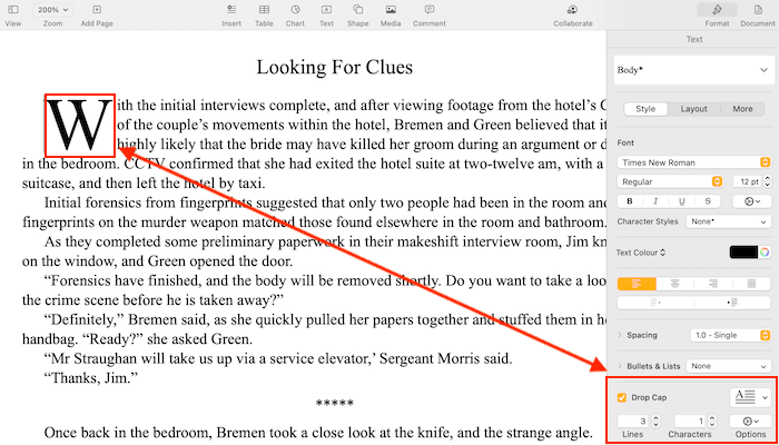
The process is similar if you use Microsoft Word, Libre Office, or WPS Office.
The only program that is not so friendly is Google Docs. It’s not easy, but it is possible with the drawing tool.
Whichever program you use, you can style your chapters however you like.
Some have better styling options than others.
You might want to experiment with a different word processor if you have the choice.
Because you will be exporting to PDF to create your publishing files, your drop caps will appear perfectly.
Drop caps in ebooks
By far, the easiest way is to use Kindle Create to style your ebook.
Like a word processor, it’s quick and easy.
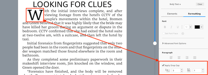
All you need to do is select the formatting tab, then position your cursor to the left of the first letter in the paragraph.
Click apply drop cap, add a little styling, and it’s done.
However, the one drawback with Kindle Create was that you could only export in .kpf format, which meant you could only use the file to publish on Amazon.
However, you can now export to .epub.
If you don’t see this export option, try to update Kindle Create to the latest version.
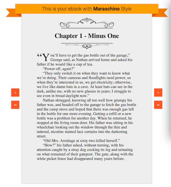
If you use Draft2Digital, you have another option.
You can select different templates that include different first paragraph stylings.
The coding option
The last option is to use Calibre to style your ebook with code.
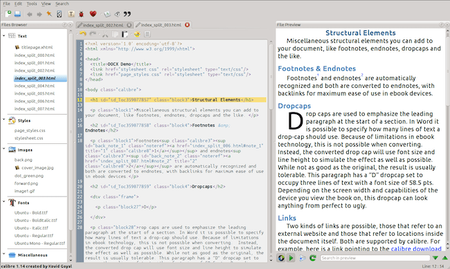
But unless you are comfortable using CSS and HTML, it might not be the best solution for you.
However, for those with technical skills, you can refer to this Calibre guide to editing ebooks.
The downside of ebooks
While it’s relatively easy, styling your ebook chapters with a drop cap can cause problems.
There are so many devices for reading ebooks, and not all of them render CSS and HTML in the same way.
No matter how good your ebook looks in the Kindle Previewer, it won’t be the same on all devices.
It can often cause issues that will affect your text formatting and make your ebook less than ideal to read.
You can find a lot of references on the KDP Community forum about the topic.
In general, most of the advice seems to point toward avoiding drop caps in ebooks.
But it’s up to you if you want to try.
Summary
Drop caps are a stylistic touch that can benefit your book if you are publishing a print-on-demand paperback or hardcover.
It’s easy to do, and depending on what word processor or software you use, you can usually find plenty of options.
I’m not so sure about ebooks. The options are limited, and the styling is less than artistic.
On top of that, you can’t be sure how well it will work on different devices.
I read a comment by an experienced author of the KDP Community. He said, “Drop the drops!”
But you have the choice, so it’s up to you.
Related reading: How To Format Ebook Chapters To Start Halfway Down A Page



To have drop caps on Kindle, your only option is to use Kindle Create and export to .kpf format (and upload that to KDP directly). Which means you’re sacrificing the use of custom fonts (Kindle Create doesn’t let you use them at all), and everything else that Kindle Create doesn’t let you do, and that because the export to .epub format mangles them (2 lines is 3 lines, 3 lines is 4 lines, etc). Because Amazon had to create their own closed source proprietary formats to better monopolize, so we pretty much can’t have these (else custom typefaces, and other advanced formatting besides) excepting:
1. You don’t want to use a custom typeface anywhere in your Kindle eBook(s).
2. You don’t mind all the other stylistic delimitations imposed on you by Kindle Create.
3. You don’t mind having to specially reformat from scratch your for-Kindle eBook(s).
I’ve attempted every method conceivable and it just does not work for Kindle, coded by-hand. Period. Oh, they’ll somewhat work, but they’ll size themselves and drop however many lines they want (you also cannot, at all, adjust their placement as to be slightly proud of the first line body text; which makes them look ridiculous when used with most decorative typefaces). You have zero control. And as they behave this way between just the Kindle Previewer and the Kindle for PC app, you can rest assured there would be even more problems with them on Kindle eInk devices, which further deviates in rendering than does the Previewer and Kindle for PC app.
More on the mangling…
Kindle Create .kpf in Kindle Previewer: 2, 3, 4, and 5 lines. (What we want)
Kindle Create .epub in Kindle Previewer: 3, 4, 5 and 5 lines. (Botched)
Kindle Create .kpf converted to .kfx via Calibre KFX Output plugin, same result as the .epub.
And when that .kfx is converted to .epub: 3, 3, 4 and 4 lines. (Extra botched)
Note that I was using the CLI method (that itself screws with the CSS less than would the Calibre conversion pipeline, that the CLI method bypasses).
Because .kpf is a proprietary closed-source format (as are all Kindle formats), we can’t actually look at the code it’s using to attempt to replicate what it is, in hand-coding outside of Kindle Create (which is what I was attempting to do by converting the .kpf). So that’s that. And I’ll reiterate, they only render as they should in the .kpf format generated by Kindle Create. Full stop.
There is a reason why almost every Kindle “look inside” is devoid of drop caps. Why Amazon’s own produced eBooks are devoid of drop caps. And why nearly all involved in the industry (indie and not alike) advocate to simply just not use them.
Too, I noted that their guidelines don’t even provide a snippet of drop caps code for ,kfx format (only for .kf8 and .mobi under their respective media queries); nice.
As a matter of fact, it was much simpler to implement drop caps in .kf8 format than it is for .kfx format. Interesting aside, I’ve noted that most interest in eBook development evaporated around 2015 (when .kfx format dropped; when making your own eBooks, for personal use or to sell on the side outside of Amazon’s “ecosystem”, became much more difficult).
____
That out of the way, you can implement drop caps just fine for EPUB; far fewer problems. Only the worst of the eReader apps (e.g. Moon+ Reader) and devices botch drop caps in EPUB format. Which is, most of the eReader apps for EPUB render them as they were coded to be; because good eReaders don’t screw with the CSS units, as to impose their own that nobody knows what they are or can even so much as look at as to attempt to compensate for it.
(Really too bad the inferior Kindle comprises ~90% of the market share, eh?)