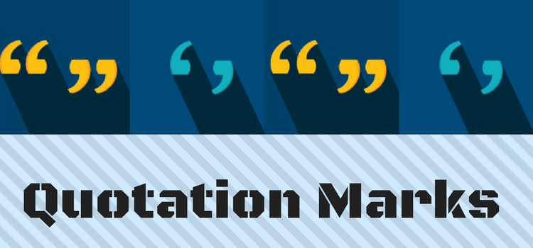
The grammar purists will have heart failure regarding my thoughts on quotation marks.
But have you considered which style is best for publishing an ebook?
Or even use them at all?
Double curly quotes, or 66-99 quotes, as they are sometimes called, have always been the standard.
Quotation marks in ebooks
In traditional book publishing and printing, styled typography helps reduce the size and impact of dialogue punctuation on a printed page.
Publishers and typographers ensure that punctuation marks, such as quotes, are unobtrusive. This allows the text to flow smoothly, making reading easier.
In ebooks, however, there is no such fine control.
Ebooks lack this typographic sophistication found in print.
E-readers like Kindle and iPad rely on the device’s settings and selected font, which can vary significantly from user to user.
This lack of control means that punctuation, including quotation marks, can sometimes appear more prominent than intended.
The uniformity and simplicity required for digital readability can lead to less refined typographic elements.
Depending on the font and size settings on a reading device, double quotations could appear heavy or too bold.
While many readers will accept this as normal, authors and publishers can choose to use single or straight quotation marks.
This small change can significantly improve reading ease, making it more enjoyable and less strenuous on the eyes.
Comparing styles
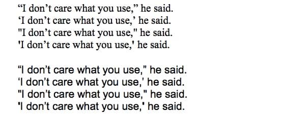
Here are four example phrases in 14-point text, which is a very common text size used by ereading devices in both serif and sans-serif fonts.
I have chosen Times New Roman and Arial as they are the most common fonts used on e-reading devices.
The example shows the phrases using the four punctuation style options.
Note how the form changes between these two fonts.
It may not seem like a big deal.
But aesthetically, I have to admit that I prefer single curly quotes when reading on my Kindle or iPad.
Straight quotes are, of course, an option, but they do look more like they belong in a technical manual.
I find them all a little unappealing, but that is only my opinion.
However, the main point is that quotes can and do change dramatically depending on the font selected by a reader on any given device.
Is it worth considering this point before publishing an ebook?
Remove them
“I like commas. I detest semi-colons – I don’t think they belong in a story. And I gave up quotation marks long ago. I found I didn’t need them. They were fly-specks on the page.” E. L. Doctorow.
As per Doctorow, there is a radical approach you can take. Get rid of them.
I read Cloudstreet by Tim Winton and was a little surprised to discover that there were no quotation marks around dialogue in the book.
It was a bit disconcerting at first, but after a few pages, it seemed natural and easy to read.
After all, isn’t a reporting verb enough? He said, she said, is all it needs. It’s obviously dialogue, so why use ugly fly specks?
The Millions has a good article on The Benefits of Excising Quotation Marks, which makes for informative reading.
Summary
So what do you think?
Should we eradicate these flyspecks on a page that serves no purpose other than that readers expect to see them?
Related Reading: Learn How To Get Your Dialogue Punctuation Right Every Time
Share This Article
I did try using single quotation marks but then, when it came to thoughts, I had to use double ones or italics. I know most modern novels have single marks and some fonts have straight ones. I don’t think it matters as long as dialogue is obvious. I wouldn’t like to read a book with none alt all.
And dealing with a quote within a quote – how would that go? And are you talking only about dialog or all use of quotes? I think omitting quotes makes for more difficult writing, more challenge with text to ensure the reader understands WTF is being conveyed. After all, you’ve tossed out a useful tool. On the other hand, more challenging writing usually makes for more interesting reading. Certainly the case with Doctorow.
I like quotations. In fact, I like the traditional double quotation marks. For one thing, when skimming a reading with a lot of quoted dialogue, the quotation marks assist a reader in skipping to the next segment of dialogue.
Formatting is an important point for e-books, since the reading medium will change – phone, pc, tablet, watch… But I’ll go to the wall for punctuation. As a proofreader, it genuinely hurts to see these things unused. If you have a reason for it, ok, roll the dice, but for my money, it decreases understanding.
Being “rich in years” (say no more…) I, of course, used double quotation marks years ago, all very proper. Just like I avoided And and But to start a sentence…I also used the Oxford comma (‘what”s that?’,.. many would now say…) .But fashions, phrases, punctuation and words change, Many writers now use single quotation marks in dialogue, and I’ve noticed a few authors started using dialogue typed in italics with no quotation marks at all. I tried it and really enjoyed leaving the heavy double quotation marks behind….As long as the content itself is crystal clear and indented when necessary, I couldn’t see a problem with it. And it was quicker to type…. Ask many famous authors about perfect writing rules, and they’ll likely say: ‘There are no rules…’ Story, plot, characterisation and clarity in the text is vital, but it’s natural that different writers will have different approaches and hurray for that!