Style and typography are the preserve of books. But there are ways to make an ebook look more like a real book.
An ebook differs from a real book because ebooks use flexible, flowing text.
The length of a line of text and the font size change depending on the size and orientation of the device used to read it.
But it’s possible to improve the look of an ebook.
Ebook formatting
Because of flowing text, you can’t add line breaks or blank lines using the return key.
The best way is to use a hanging first-line indent for each new paragraph.
This avoids text in long un-paragraphed blocks.
Depending on the publishing platform, if you add blank lines using the return key, the conversion process will usually delete them.
There is also no means to select fonts.
It means that you will lose any styling using non-standard fonts.
For an ebook, Times New Roman is standard and only allows for italic, bold, and underlined styling.
For font sizes, it’s best to stay between 12pt and 24pt.
Ebooks use only single-line spacing and kerning, so letter spacing is not possible.
Even with these restrictions, though, there are still a few ways to use formatting to make an ebook look and read more, well, a little bit more, like a real book.
Use Page Breaks
Run-on pages do not look good in an ebook, especially at the start of an ebook.
Use page breaks to separate the title, credits, dedication, and Table of Contents pages.
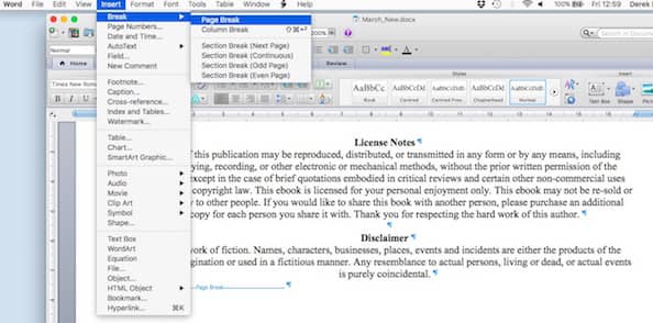
You should also use page breaks between chapters.
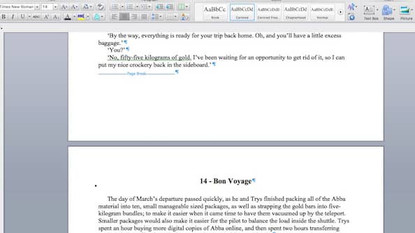
Insert a page break so that each new chapter starts on a new page.
Making Space
Never try to add space using the return key, as these spaces will disappear when your file is converted into ebook files such as epub or .mobi.
The only way to add space between lines is by using the format paragraph function in Word.
This is particularly useful for adding space between a chapter title and the following text, which looks much more appealing to a reader.
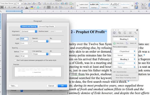
Another use for line space is to add a little clear space between separators.
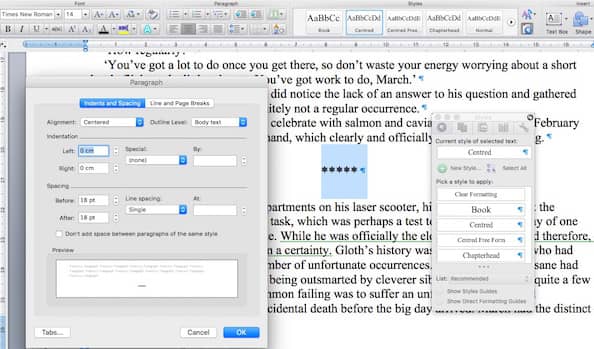
With these few enhancements, an ebook will be more appealing to a reader.
Sure, it’s not a lot, but at least these few tips will make your ebook more enjoyable to read.
Ebook typography
If you use Draft2Digital, it has an easy way to improve the typography and formatting for ebooks.
Here is an example of what you can do.
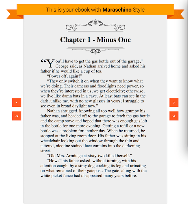
If you publish with Amazon KDP, another option is to use Kindle Create to style your ebooks.
It is especially useful for writers who publish poetry and need special formatting options.
Summary
A book is a book, and an ebook is an ebook.
So there are limitations in what you can do.
The most important factor is making your ebook visually appealing and easy to read.
Paying attention to your formatting is the best way to make the reading experience more enjoyable and engaging for readers.
Ensure your formatting is consistent throughout your ebook, and always check it on different devices before publishing.
Related Reading: Format An Ebook In Apple Pages Before You Publish


