You’d be surprised how many visitors to your site are snack readers who skim and scan your writing. They want an answer, and if they don’t get it, they move on very quickly.
You probably do it yourself when you are searching online for information or an answer to a question.
The proof is in your site statistics or analytics. When you check the time visitors spend on a page, or your site, how many stay longer than 30 seconds?
However, short site visits are not necessarily bad news. It can mean that visitors found the information or answers they were looking for before moving on.
What do you want your visitors to do?
You work hard on your website or blog for a good reason.
Perhaps you are trying to sell your new book, build your mailing list, or rely on advertising for your income.
Whatever your motivation, you would like your site visitors to do something.
Do you want them to click on an affiliate link or your book link?
Do you want them to subscribe to your mailing list or stay long enough for your ads to register as payable views?
If your articles are informative, long-form, and well-written, that’s great for attracting new visitors from Google, Bing, or social media.
However, a new visitor will rarely stay long enough to read all 1,000 words or more of your text.
If you check your analytics, you’ll probably see something like the example below from my site.
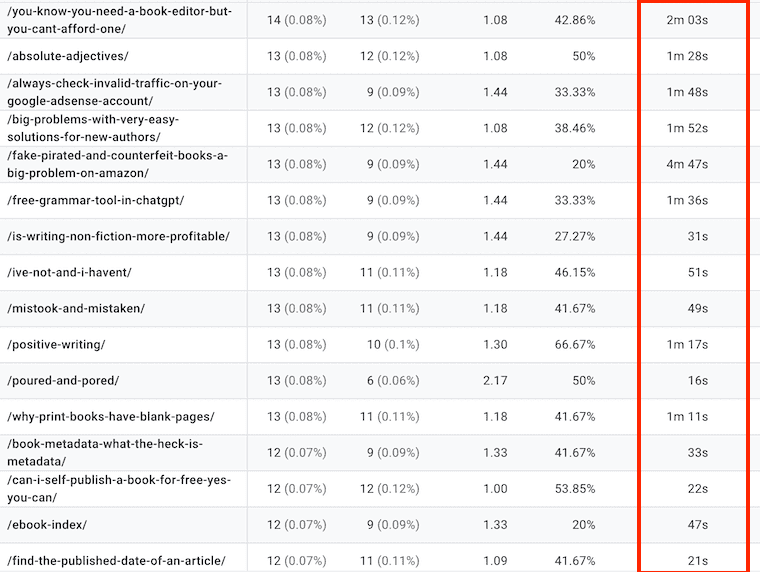
As you can see in the red box, yes, some visitors stick around and read, but many only stay for a short while. So, what snackable content do these visitors see?
Do a 15-second test
When you look at some popular pages on your site, what do your visitors see immediately and then in the first few seconds of scrolling?
The easy way to check this is to read one of your posts for 10 to 15 seconds and see where you end up.
Now, look back from that point. What do you see? How many of your ads are visible? Is there an affiliate or internal link?
Can visitors see your subscribe invitation or your book promotion link?
If your text is 1,500 words and your book link is at the end, how many visitors will get there?
You might have other forms of a call to action, but will snacking and skimming readers see it?
While sites or blogs can have a range of different purposes, it is what a reader first sees that is always the most vital element.
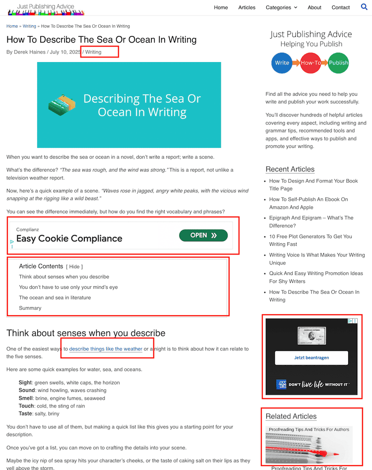
In the screenshot above of one of my pages, you can see the main action points highlighted in red.
Because my site is ad-supported, two ads are visible after a very short initial scroll. I don’t have an annoying ad at the top of the page because it would push down my content.
There are also links in the table of contents, a category link at the top, an internal link to a similar topic, and the first related article thumbnail.
As for the text, the introduction partially answers the question by explaining the difference between a report and a scene.
The first heading then gives the advice of using the senses when writing about the topic.
You certainly don’t need to copy the layout or placements in my example above. Every site is different, but it might give you food for thought about what your readers, and especially snack readers, can see and do in a few short seconds.
Making the most from your visitors
Visitors arrive at your site or blog for different reasons.
Some use search engines and want instant information when they land on one of your pages or articles.
Others might come from social media because a post piqued their interest and might read more of your writing.
You sometimes get visits because another site has a link to one of your pages.
It is usually a link about a specific topic point, so these readers may want the information quickly, without having to scroll through 2,000 words of text.
No matter how a visitor arrives on your site, you want to gain the most from them before they leave.
The best way to achieve this is to concentrate your efforts within the first viewable section of your page, and the first short scroll.
It might sound like making your pages top-heavy, but that doesn’t need to be the case.
Improving the first impression

You can optimize your blog layout for short attention spans without instantly annoying a new reader with lots of buttons, ads, or pop-ups.
Try moving a couple of your more important elements higher on your pages. But don’t crowd out the text of your article or blog post. A large header image can push your text below the first viewable area, so making it smaller can help.
If you are an author and have your book buy links and cover images at the end of your articles, that’s fine.
However, you could add an inline text link early in your articles to one book. That way, you stand a better chance of it being clicked.
The same goes for an affiliate article. If you are writing about “The Best Laptop For Students,” you will have links within your text, but do you have one in the first 100 words?
As for ads, it’s always about striking a balance. Too many ads can be a turnoff for readers, but too few will affect your potential earnings.
There’s also the technical aspect, where ads above your articles can slow down your page loading speed. They can also cause your page to jump and move while an ad loads.
Yes, you want your ads to be seen, but they shouldn’t dominate your pages or impact your page loading speed and user experience.
One last tip is about external links, which are great and can add credibility to your articles.
Since these links take visitors off your site, place them later in your article. If you have an external link in the first few paragraphs, you could lose a new visitor in seconds.
Also, make sure that the links open in a new tab or window. That way, your visitor remains on your site in its existing window or tab.
Summary
Short visits by snack readers are how the internet works now. People want information or answers as quickly as possible, and they will scan, skim, and scroll to find it.
However, you can still gain a lot of value from these visits if you plan your site layout or format well.
If you want to really see how visitors navigate your pages, you can use Microsoft Clarity to view their movements on a page. It can help you decide where best to place your links and ads.
In most cases, placing them towards the top is preferable to putting them deeper in your text. However, that doesn’t mean overdoing it.
Concentrate on one or two actions (or ads) that are of the most value for you. Then spread your other action points evenly through your articles or posts.
Then you can make every visit count, whether it’s for a snack or a full meal.
Related Reading: Publishing The Same Content On Multiple Platforms
Share This Article
