When you format an article for online readers, your primary objective is to make it pleasing to the eye and easy to read.
While a compelling title can draw in search engine users, you only have a few seconds to make a positive impression. You risk losing a new visitor quickly if the reading experience is poor.
Unlike in print, you need to format your articles for online reading to ensure readability across various devices and screen sizes.
But it is easier than you think if you follow a few fundamental guidelines.
The seventy percent principle
I use this general guide by inverting the 30% ad density guideline by the Coalition for Better Ads.
In simple terms, it means that at least 70% of the vertical height of a webpage should be your article content.
Ads are certainly one distracting factor.
But there are also call-to-action frames, video players, hero headers, sidebar widgets, subscribe pop-ups, author boxes, and related reading panels.
When there are too many distractions, it makes an article difficult to read and navigate, especially for phone and tablet readers.
There’s no tool to measure content percentage.
You can only scroll down and make a visual estimate on desktop, tablet, and phone screen sizes.
But after the initial above-the-fold section, the text and related images of your article content should occupy close to 100% of the screen.
If you post regularly on your site, the best way to format an article is to check and adjust your theme settings. Then, you can bring uniformity to all your articles.
Let’s look at some elements you can improve to make your articles more appealing.
1. Use plenty of white space
White space is the empty space between your lines, paragraphs, headings, bullet points, or images.
It is also the margin or space you leave on the left and right of your content.
Using white space makes reading and navigating much easier, especially for readers who scroll with their fingers or thumb on mobile devices.
You can usually find these settings in your site’s theme, or perhaps you might need to add a few lines of custom CSS.
You can add white space for text by adjusting your line height and the space after paragraphs. When you use images, make sure they don’t sit too close to the text.
Using white space effectively will improve the aesthetics and readability of your articles.
2. Select an easy-to-read font

Font selection, size, and color make a big difference in readability.
Generally, sans-serif fonts similar to Arial or Helvetica are easy to read. Serif fonts like Times New Roman are okay but can seem a little too formal.
But you should avoid fancy and decorative fonts like Comic Sans, Papyrus, or Curlz MT.
As for font size, the minimum for acceptable readability is probably 16px, which is approximately equal to 12pt in print.
The text you are reading in this article is 17px, or 13pt.
Color is also an important consideration. Stark black is harsh on the eyes, so it’s a good idea to scale the body text back to a dark gray.
3. Short sentences and paragraphs

Reading on a screen is different from reading in print.
Online readers can lose interest quickly if they strike large blocks of text that are hard to follow and understand.
Generally, sentences of no more than 25 words and short paragraphs of three sentences or fewer work best.
But it doesn’t mean you have to reduce the reading level of your writing.
When you format your article, you only need to space your lines of text to make it easier to read and understand.
4. Add paragraph headings
Paragraph headings not only break up your text but also make it easier for readers to navigate your article.
If someone is looking for specific information, headings make it easier and quicker to find.
Another benefit is that you can use your headings to create a table of contents if you use a TOC plugin on your site.
Your headings should be clear and concise, and follow a logical order.
The amount of text after each heading should be around 150-200 words.
But if you find that you have used 300 words or more, try inserting an extra heading to break up the text.
5. Add variety to your text
You can use bullet points or numbered lists to summarize your main points.
You might outline the steps in a process with a numbered list or highlight key benefits with a bullet list.
Other ways you can vary your text is to use bold, italic, or underlined text.
6. Include images
Use images that compliment your text.
You can use some for decorative value only to break up a long text.
But screenshots, graphs, tables, or photos can bring real value to an article.
Sometimes an image can say more than your text—for example, a graph showing a progression of positive or negative trends.
If you are explaining a process, screenshots are an ideal way to show your readers how to do something.
The only caution with images is not to make them too small or too large. Size them to suit the purpose.
7. Check your ad density
If you run ads on your site, you can check your ad density with Google Chrome Developer Tools.
You need to select Lighthouse from the tools menu.
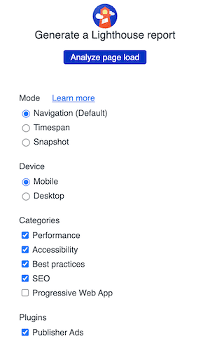
At the bottom of the options screen, tick Publisher Ads.
After you run the test, you can check the ad density result.
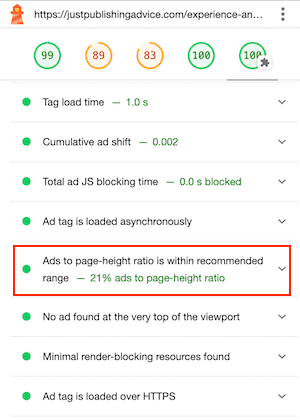
As I mentioned earlier in this article, the recommended maximum density is 30%. You can see that for the page I tested, mine is 21%, so it passes the test.
8. Think like a reader

Everyone has different tastes.
But most people find articles with blocks of unformatted text, clutter, distracting pop-ups, and too many ads an unpleasant reading experience.
Worse still are pages with ads and pop-ups that overlay and hide the text.
The best way to decide what to change to improve the format of an article is to read it on different devices.
Look for elements that reduce the online reading experience and decide how to improve them.
Another way is to visit a site where you enjoy reading articles or posts and decide why you do. Then you can implement these ideas on your site.
You only have a few seconds to win over a new reader, so make everything count in your favor.
9. Creating uniformity
If you publish articles regularly, it’s easier to make global changes to your site.
Rather than formatting each article before you publish it, you can use your site settings to standardize the look of all your articles.
For example, perhaps the number of paragraphs before your table of contents, or before the first ad on a page.
You can use global settings for fonts, line height, paragraph spacing, and text colors.
Yes, you will always have to fine-tune a new article a little. But you can save a lot of time and achieve more consistency using site-wide settings.
Summary
If you don’t have your own site, many elements I have outlined above also apply to article submissions.
You can format your article in your word processor to ensure it looks perfect when published.
When it comes to encouraging people to read your articles, the best ways are to make them appealing to the eye, easy to read, and also a breeze to navigate.
Online readers are fickle and will close a page instantly if it doesn’t appeal to them.
That’s why presentation and formatting are such vital factors. Your text might be well-written, inspiring, informative, and high-value.
But if your article design doesn’t grab a reader’s attention within two seconds, you’ve lost a reader.
Related Reading: How To Publish An Article On Google – Your Choices

I like the way you think