Good blog design is how you keep readers on your site. Here are some blog design tips for authors to help you create, update, or refresh your site.
There are so many options, plugins, widgets, and add-ons that you can use with blog themes now. But blog homepages often become cluttered with too many of these elements.
Design trends now are most definitely leaning towards minimizing components and maximizing user experience.
If you want to create a beautiful website design that will please your visitors, less is always more nowadays.
What are the critical factors in good blog design?
Without a doubt, the color scheme that you choose is number one.
It creates the look of your blog.
But it is closely followed by typography, font sizes, and layout design.
Readability and functionality on small mobile devices are also vital.
It is essential to make sure that your blog post pages are beautifully designed.
Concentrating only on customizing the blog homepage is a mistake a lot of new bloggers make.
All of these elements can be changed, modified, or improved on any free blogging platform or hosted blog.
Then there are technical considerations like SEO and site speed.
All of these elements contribute to a great user experience for your readers.
Now let’s look at each of these blog design tips for authors in more detail.
1. How do you choose a color scheme?
One of the secrets of an eye-catching design is to use a color palette.
You are not restricted to the colors in your blog template or WordPress theme. You can change the color of any part of a blog.
Your first step is to find a color scheme you like. Perhaps you could think about the colors you use for your book covers. There are many free sites, but I chose Color Hunt for my examples.
You can choose from hundreds of different color combinations like these.

When you find one you like, mouse over each color, and you will see the CSS hex color codes.
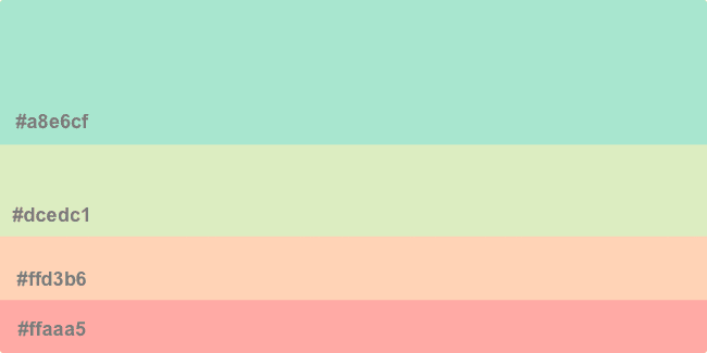
Copy these hex codes and keep them to use when you customize the colors of your site.
Pastel colors are very popular. But there is nothing wrong with using vibrant colors if they suit your blog topic.
The example above is a four-color set. But you can find a lot of combinations if you do a Google search for color schemes.
The other two colors that you will use are white background and black for your text. But be careful because stark black on white can be a strain on the eyes when reading on a screen.
The trick is to use a dark grey instead. You don’t have to reduce too much from plain black to make your text easier to read.
The hex code for black is #000000. On this site, it uses #3f3f3f. You can experiment to see what shade works best for you.
2. What are the best blog layouts?
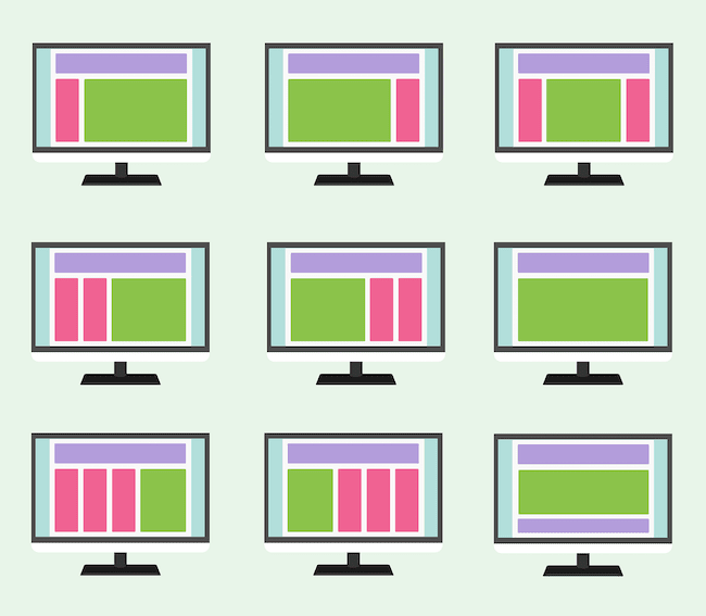
There are many options for blog page design and layouts on free and paid blogging platforms.
You probably have a choice similar to the image below. You can also choose full-width or boxed designs.
But there is a problem with most of these options.
All of the sidebars in these templates will disappear from view on a mobile device. They are only visible after all the other content of a webpage.
It makes them wholly useless for mobile users, who represent over 60% of internet traffic.
Sidebars usually contain social sharing buttons, ads, featured posts, and call-to-action elements. All of these will be lost to mobile visitors.
How do you solve this problem?
The best solution is to use a single page layout and add many of the sidebar elements to the footer.
You can add social media icons, links, small ads, and even popular posts.
Another solution is to include ads and images within your post using text wrap. They will be much more effective, especially if you are content marketing.
A good blog post now is a single page and includes large featured images at the top of the page. Adding a few more images within the text helps break it up to make reading easier.
3. Why does typography matter?
Your choice of font says a lot about you.
Serif fonts say you are news and serious and sans serif fonts say you are more relaxed.
The most common fonts are Arial, Open Sans, Oswald, Georgia, Garamond, Montserrat, Merriweather, Roboto, Raleway, Playfair Display, Alegreya, Helvetica Neue, and Lato.
You should avoid fancy fonts like Comic Sans, Papyrus, Brush Script MT, and Lobster. These might be fine for a one-off headline, say on a food blog. But they are terribly difficult to read when used in general text.

You have something important to say on your blog. Say it with a font that says you are serious.
Don’t use fonts that will make you look like a clown.
Stick with standard fonts and choose one that reflects the subject of your blog. By the way, this site uses Raleway.
4. How important is your blog’s homepage?
Would you be surprised to know that less than 10% of site visitors ever go to a blog’s homepage?
Most of these homepage hits come from people who find one of your articles on Google or Bing search. They go there to see what else they can find.
So, give them that something.
It’s best to have a top menu that leads to your most important pages. Then you can add other related or popular parts of your site.
New bloggers overestimate the importance of a blog homepage. It usually has very little text, so it doesn’t stand a chance of being ranked highly by search engines.
Filling it with widgets, flashing ads, and call-to-action pop-ups will not achieve a lot. All it will do is slow down the site and make it unfriendly for mobile visitors.
One of the best blog design tips for authors is to keep your homepage design as simple as possible. Make it elegant and attractive. Make it a statement of purpose.
But more importantly, make it a page where visitors can easily find what you want them to read.
One page parallax design is perfect for this goal.
Here is an example parallax home page from ThemeGrill.
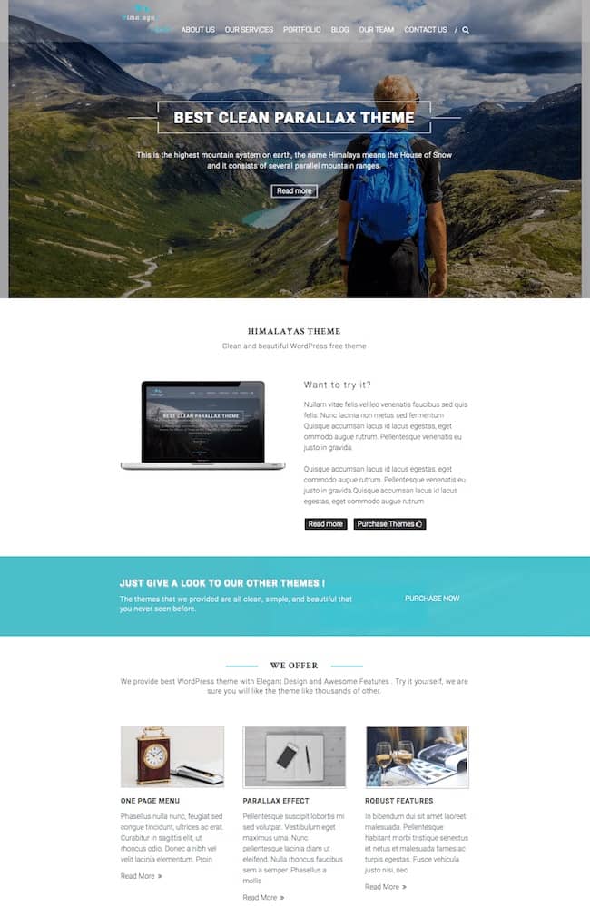
Don’t overcrowd your homepage. Use it to direct your visitors to other pages, which will help reduce your bounce rate.
5. How can you make your blog post pages work harder?
Almost every site visitor you get from search engines will land on one of your blog post pages.
It means that you have to make sure they stay long enough to read your post and then want more.
Blogs often have a high bounce rate of between 65-75%.
This is normal because a lot of people are looking for an answer to a question. If you answer their question, they are satisfied. But then, naturally, they leave.
The key to a great post page is to give them excellent reasons to look for more on your blog.
You can do this in many ways. The most obvious is related post links at the end of an article. But do all visitors read to the end?
No, because they often don’t get much further than 50% as they found what they were looking for in the first few paragraphs.
Because of this, you have to include internal links to related posts much earlier.
Ideally, you should have at least one very early in your post.
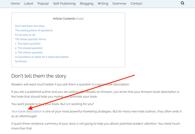
You can see in the example above that the first internal link is just after the contents box.
It’s a good idea to add three or four to your article.
Not only will they reduce your bounce rate, but you will also improve your link juice for Google rankings.
6. How can you make your blog more readable?
The most significant factor for readability on a blog is white space and short paragraphs.
Again, mobile users are the top priority. You need to factor in the practicality that they need room to scroll with their thumb.
Secondly, long blocked paragraphs of text are extremely difficult to read on a mobile phone screen.
Give your readers lots of space. Short paragraphs work well on laptops and desktop computers too. You are not writing an academic thesis.
Keep your text open, spacious, and very easy to read on any device.
A surprising factor in readability is your use of images within each one of your posts. A featured image at the beginning is almost a must.
But by adding more images, your post will be more visual and appealing. A good rule of thumb is to add an image for every 100 to 200 words of text.
You should use relevant images that help tell your story.
While free stock images are fine, it is always better to create unique images.
7. How much functionality do you need?
Designers and developers of blog themes are constantly adding more and more features to attract users and customers.
But all of these additional CSS elements and javascript files increase the size of a site and slow down the loading speed.
It can have a severe effect on mobile page speed, especially.
It is well documented that if a page takes longer than three seconds to load, you will lose your visitors.
You need to pay attention to every element that you are using on your blog. In particular, social media widgets and sliders can be resource hogs.
Even something as simple as a contact form plugin can cause issues—some plugins load code on every page instead of just the one contact page you have.
One of the major causes of a site that fails the Google Pagespeed test is javascript elements that are only used on one or two pages but are being loaded in the background on all pages of your site.
It also applies to CSS code.
You might think that a theme with all the options, bells, and whistles is a great choice.
But in fact, it is much better to select a lightweight theme and add only the functions and options you really need.
The big trap for new bloggers is adding too many elements to blog homepages. As I mentioned earlier, very few visitors will land on your homepage.
Filling it up with widgets, banners, ads, and popular posts will not only make your homepage slow but will also slow down the rest of your site.
You can see how too many elements (requests) and poor blog design affect site speed in this test result.

If you are more selective, you can reduce your site speed quite a lot. This is a test of one of the pages on Just Publishing Advice.

There are many tools you can use to check and improve the loading time of your blog.
We have listed the nine best speed tools in our related article about site performance.
If you can get your pages to load in less than three or four seconds, you’ll have done a great job.
Summary
The best blog site designs are clean, light, and fast loading. These three tips apply to blog design for authors.
No matter what design inspiration you have, or your budget for an author website, you can always make it attractive as well as functional.
You should concentrate on how a blog post looks on your site more than how your homepage works.
When you search on the net for examples of great blog designs, you will almost always get results that highlight the homepage.
If you find a design you like, make sure you check what a blog post page looks like for the theme. It is far more important.
Then test the page using a speed test tool. If you get a very low page speed score, it might not be a good choice.
A beautiful blog will always help you to promote your books. Spend some time on your design elements to help you engage and retain your readers.
Blog design and writing engaging content that is easy to read and presented in an attractive layout that loads fast are the main ingredients for a successful author blog.
Related Reading: 10 Must Read Self-Publishing Blogs For Authors And Writers

